Modernizing a Healthtech Job Management System
Update for the information architecture of a hiring management platform serving thousands of medical practices and significantly reduce the need for hand-holding during the onboarding process.
Role
Lead Product Designer
Timeline
8 weeks (2024)
Team
1 designer, 1 PM, 2 developers

The Challenge
I was brought in as the sole designer for this job search startup in the health space to improve overall platform UX and drive more innovation.
Internal account managers were spending upwards of half their days onboarding new customers
We needed to come up with a solution to allow for more intuitive onboarding and free up their time for more valuable tasks
Impact
New backend structure was found to be far more intuitive and projected to increase onboarding speed by 30%.
Design Process
Research
Understand the key needs of new customers
Understand
Map out the existing user journey and identify pain points
Iterate & Test
Map out new journeys and review them with Account Managers
Deliver
Develop UI based on new user journey structure and break into pieces for development
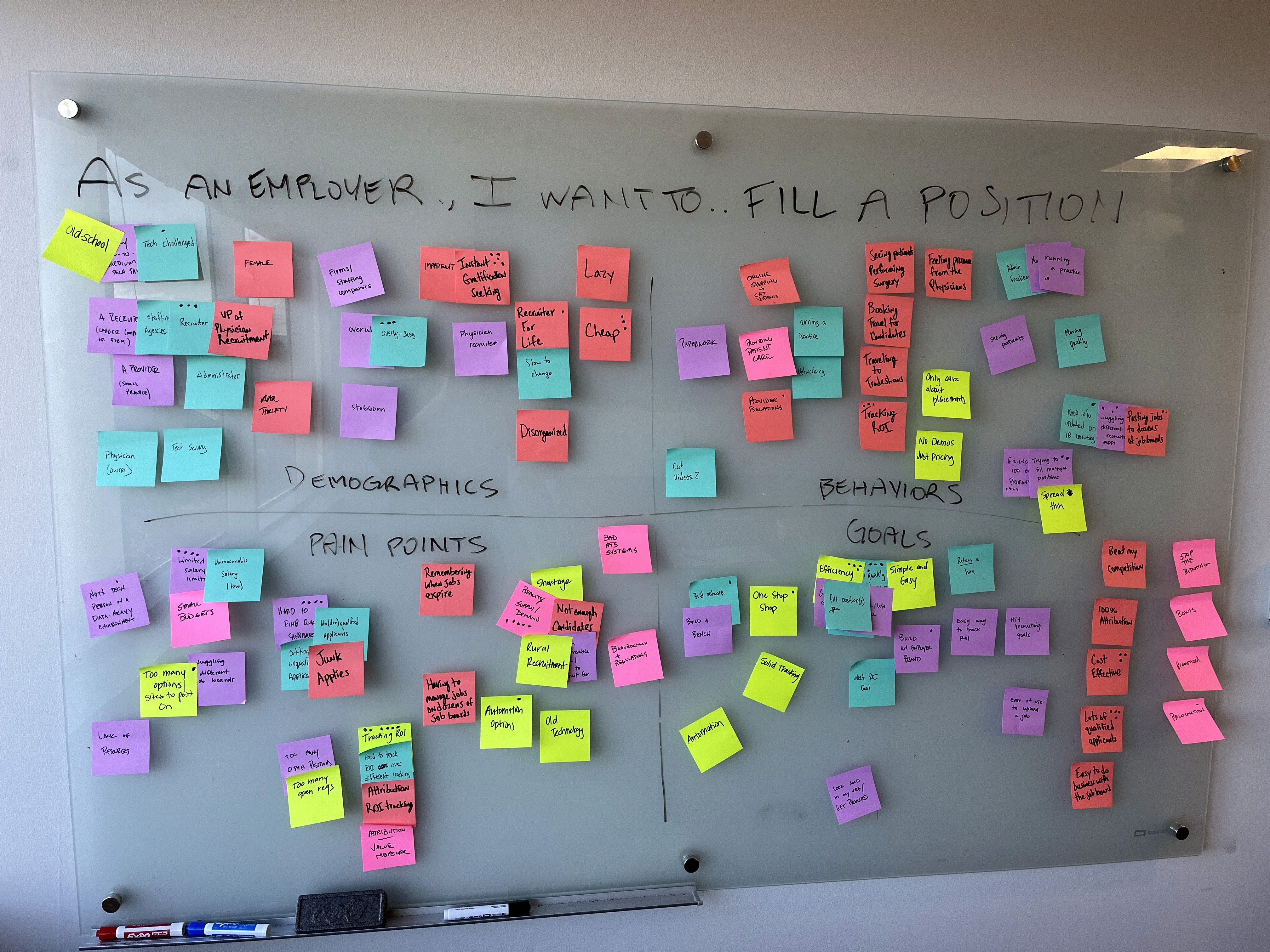

User Research
Our user persona was described as having deeply ingrained habits and patterns. This told me we would need to adapt our tool to users rather than getting them to adopt new patterns.
After speaking with several users a pattern emerged indicating that the way the management platform has been laid out was wrong at a fundamental level. Users needed another layer of organization from the beginning in order to best do their jobs.
User Journey Iterations
The existing user journey was filled with unclear dependencies and repetitive navigation structures. We needed to reorganize the structure at the highest level to prevent unintended modifications to job postings and clearer permissioning structures.
After discussing several options with the account managers (the subject matter experts for these efforts) we decided to move forward with a nested navigation structure. While this would require more clicks for the user to navigate, our team decided that reducing the risk of accidental edits to location and job information would bring more value to users.

BEFORE

AFTER
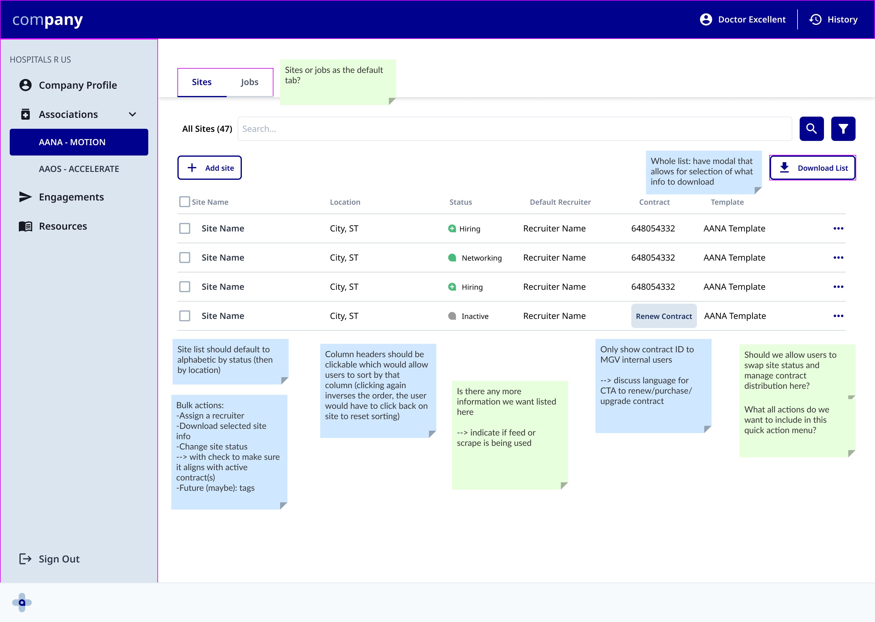
Solution
Final designs were developed based on new proposed information architecture structure.
After another round of testing, account managers predicted that this would significantly reduce the need for their involvement in the onboarding process and increase speed of onboarding by up to 30%.