Simplifying Healthtech Patient Management
Created and refined scalable information architecture and design system patterns to improve sales and prevent churn of up to 1.6k users
Role
Lead Product Designer
Timeline
4 months (2021)
Team
1 designer, 1 PM, 3 developers
The Challenge
Internal teams at the client were primarily focused on maintenance of the product and had limited capacity for innovative initiatives.
My team was brought in to inject some development speed and help drive the 2021 goal of modularizing the product platform
Impact
Modular product structure was developed that prevented the churn of nearly 1,600 users brought on in an acquisition.
Design Process
Research
Understand the existing flow and where dependencies block modular product structure.
Iterate
Explore new information architecture and user journey flows.
Validate (x2)
Test new proposed structure with users.
When unsuccessful, repeat iteration and testing.
Deliver
After successful validation, finalize designs and hand off to developers.

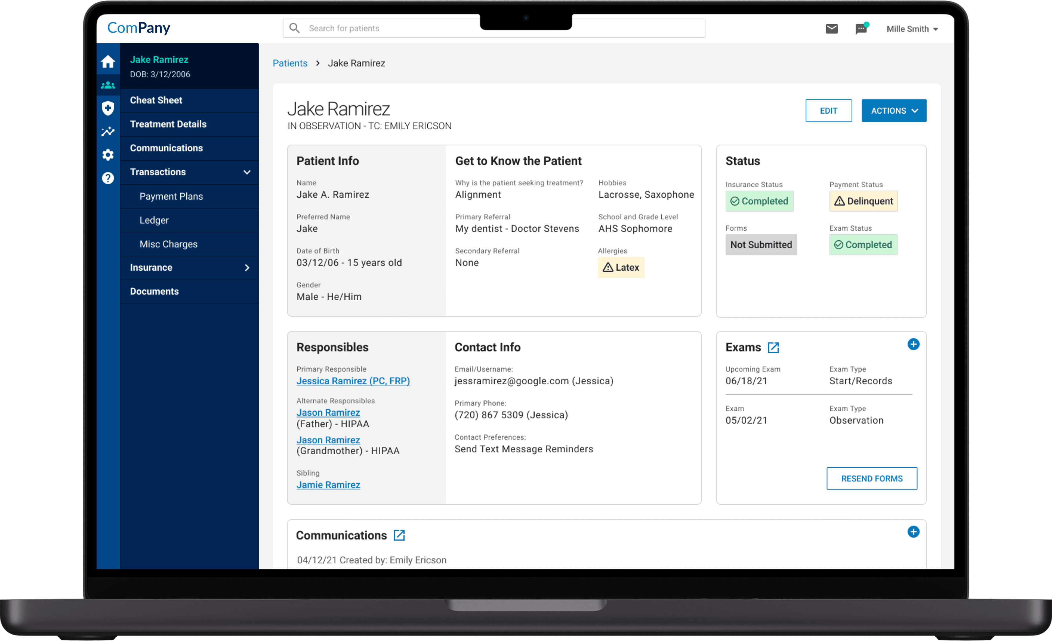
User Journey Exploration
I began by mapping out the existing user journey to understand the most common interactions points and where any dependencies existed.
Only once we knew our limitations were we able to begin iterating and proposing new solutions.
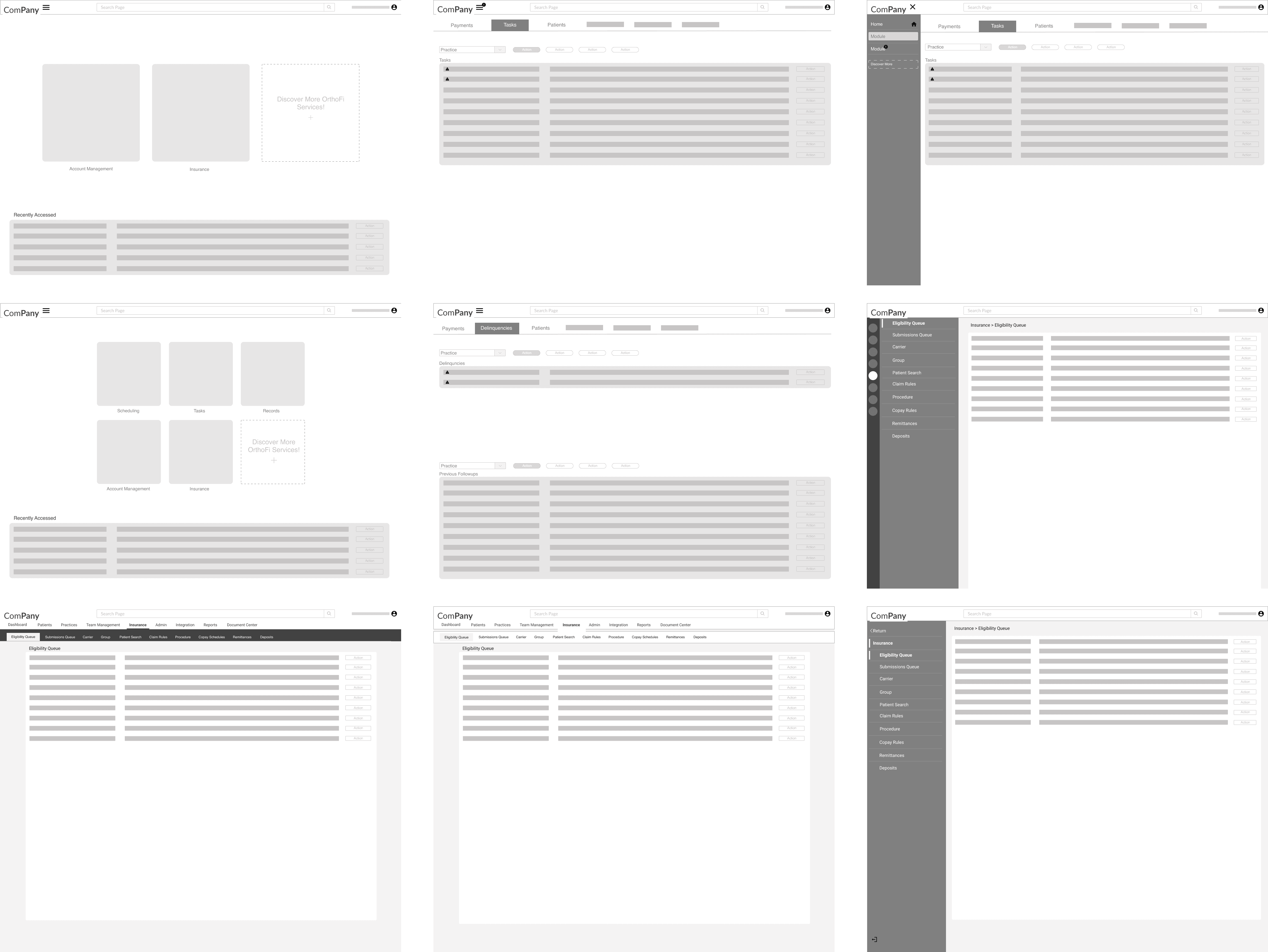
Information Architecture Iteration
My team explored a variety of potential solutions that would allow for the platform to offer modular products.
Once we had exhausted our options and identified the top choices, we brought them to our client's team and discussed pros and cons until we selected a favorite to move forward with.
User Validation
Once the team had identified a design direction, I created prototype flows that I tested with 5 power users of the platform.


" This is so much easier to use than the old one — I have everything I need right here for talking to a patient before they go speak to the doctor "
Solution
A new scalable system for information architecture and design patterns was delivered to the client.
The new structure would allow their product to be offered in multiple formats, which would increase their market share and prevent the potential churn of 1,600 users acquired in a competitor purchase.