Streamlining the eCommerce Purchase Experience
Modernization of an ecommerce platform to increase conversion rates and drive an additional 5+ million in sales.
Role
Senior Product Designer
Timeline
6 weeks (2022)
Team
3 designers, 1 PM, 2 devs, 1 data analyst

The Challenge
Our team was in charge of innovation for the ecommerce platform, with conversion rates acting as our main KPI.
Data was showing a steep drop off in the funnel after users first landed on the platform — higher drop off than seen in competitors
We needed to figure out what was causing the drop off, and then come up with a quick solution to address the issue
Impact
New designs and an updated user journey resulted in a 10% conversion uplift.
Design Process
Research
Understand what is causing the drop off
Iterate
Quickly come up with solutions
Test
AB test top solutions to measure success rate
Deliver
Release top solution and track impact
Understanding the Problem

Through market research we identified a key part of traditional ecommerce flows that our product was missing — the categories page.
Coming Up with Solutions
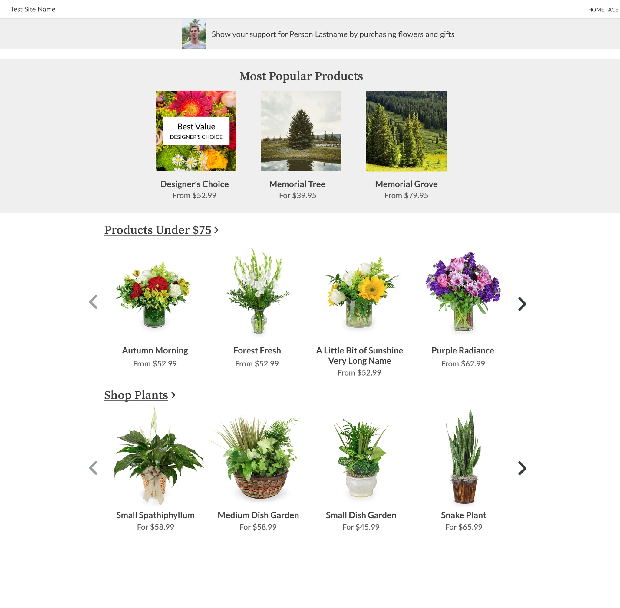
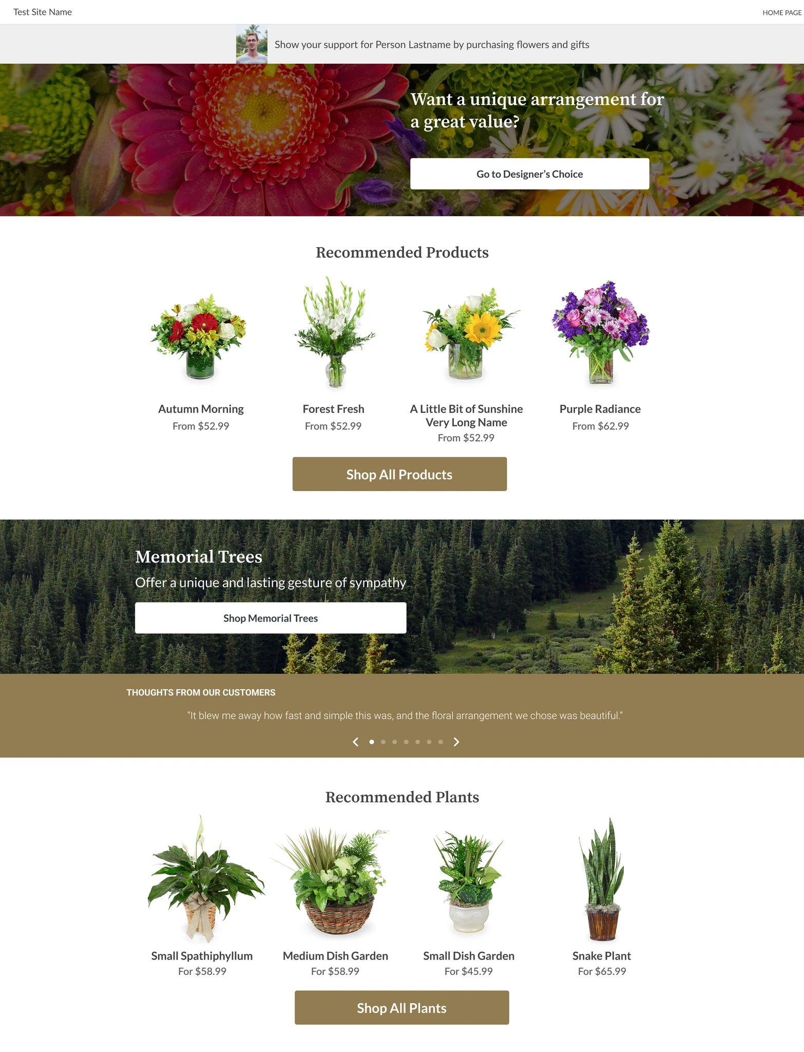
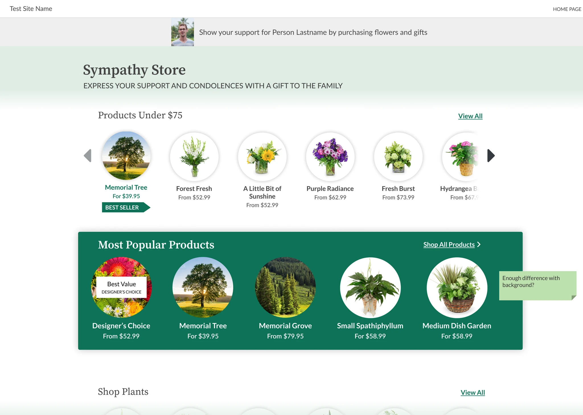
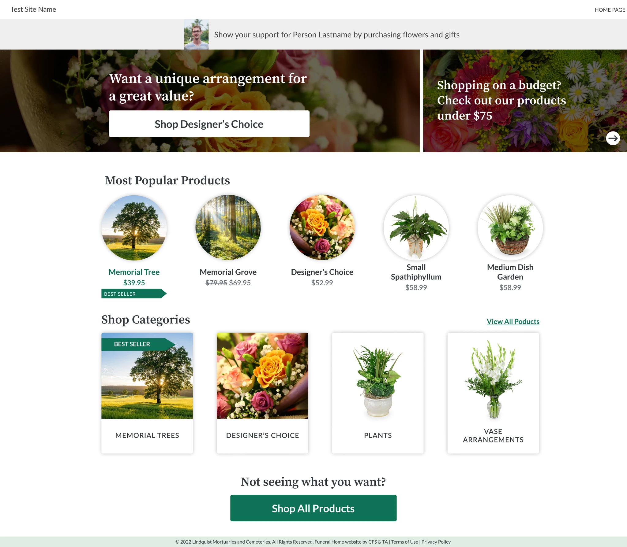
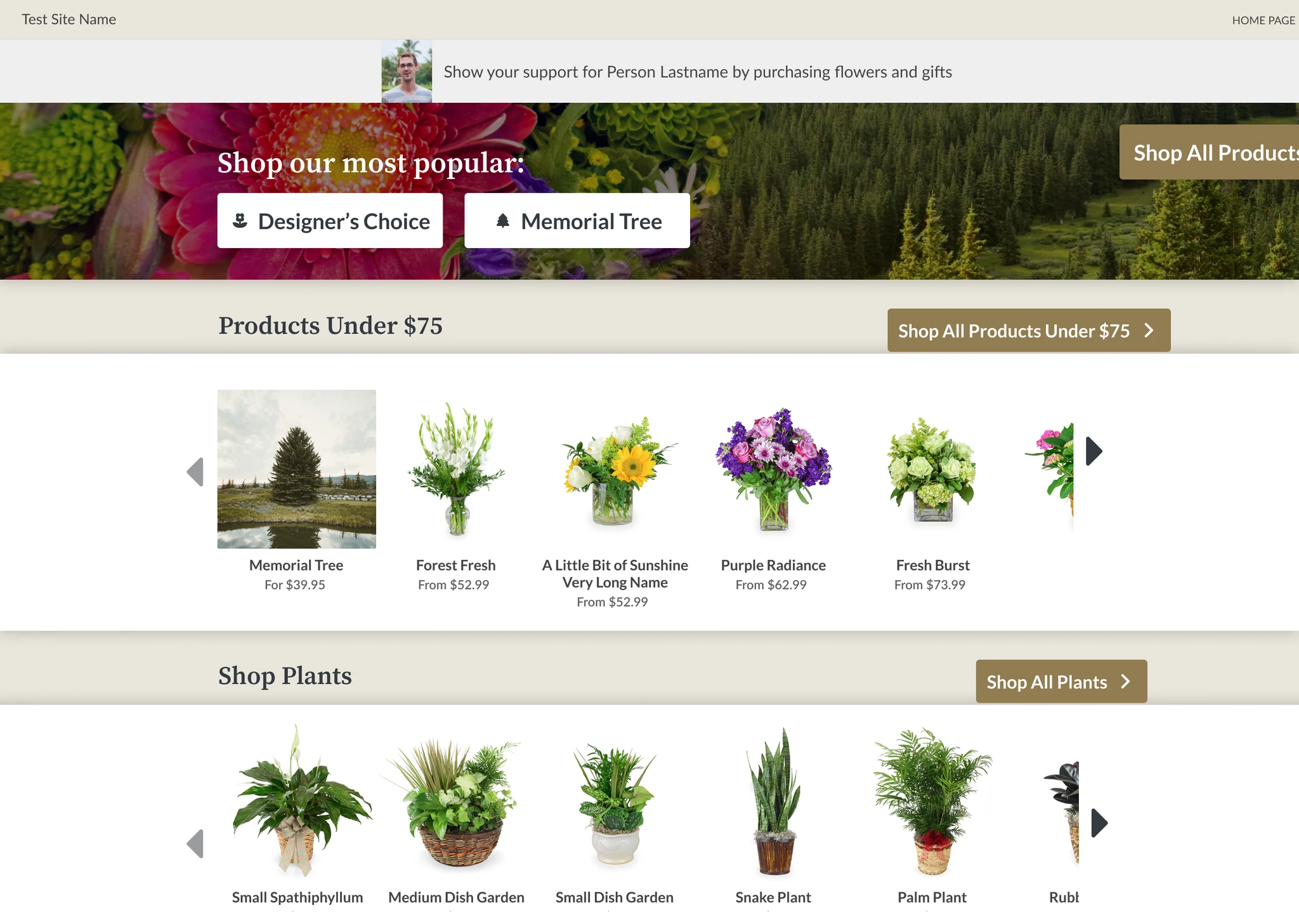
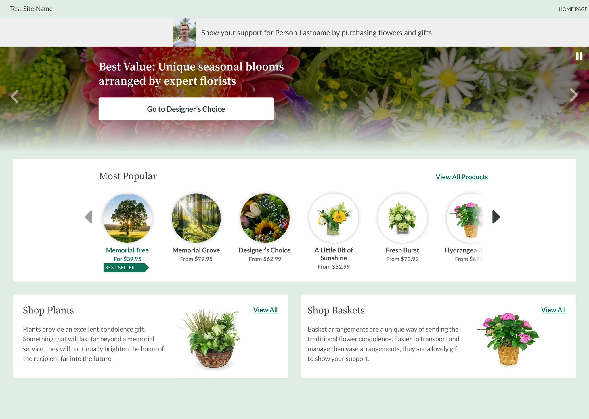
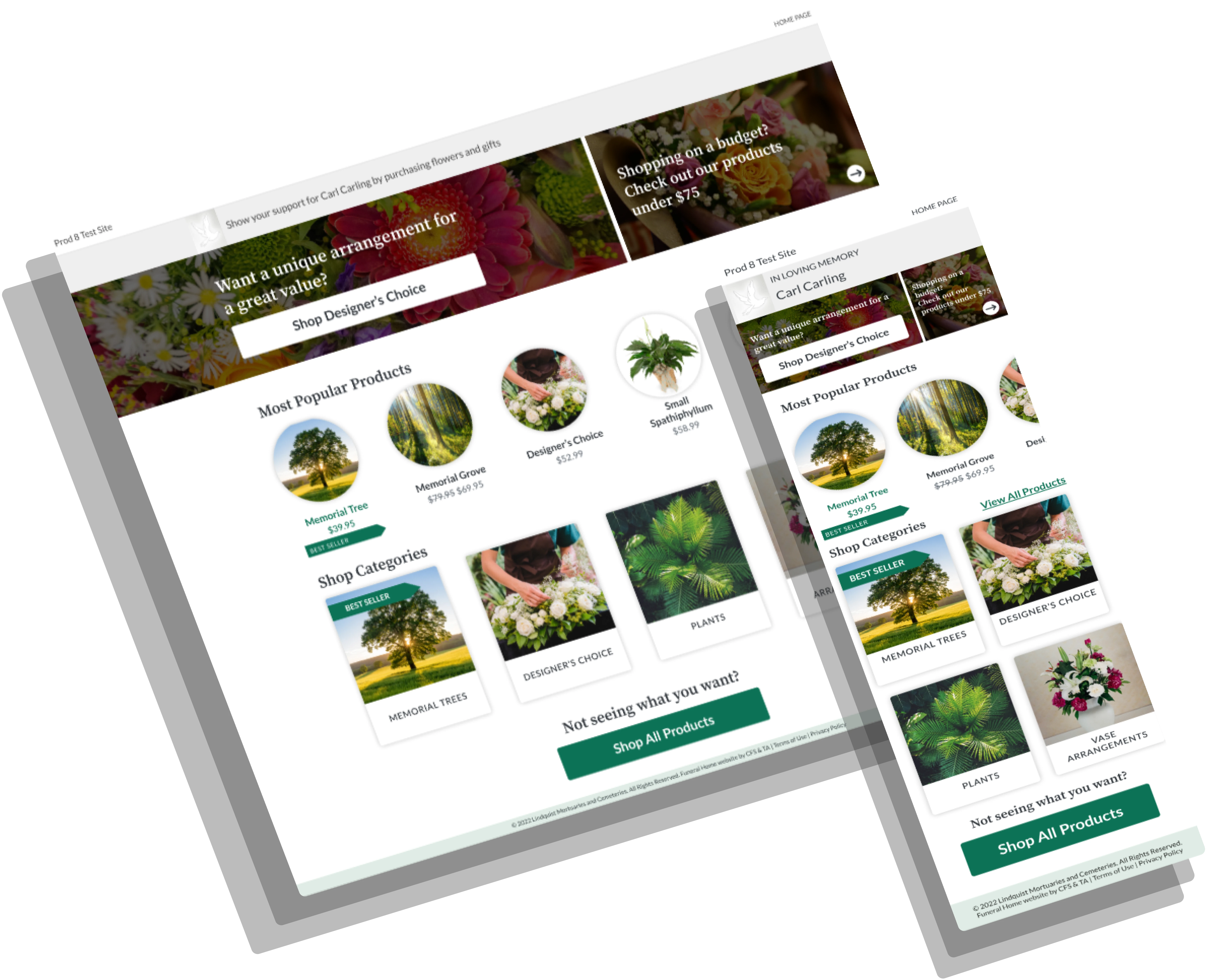
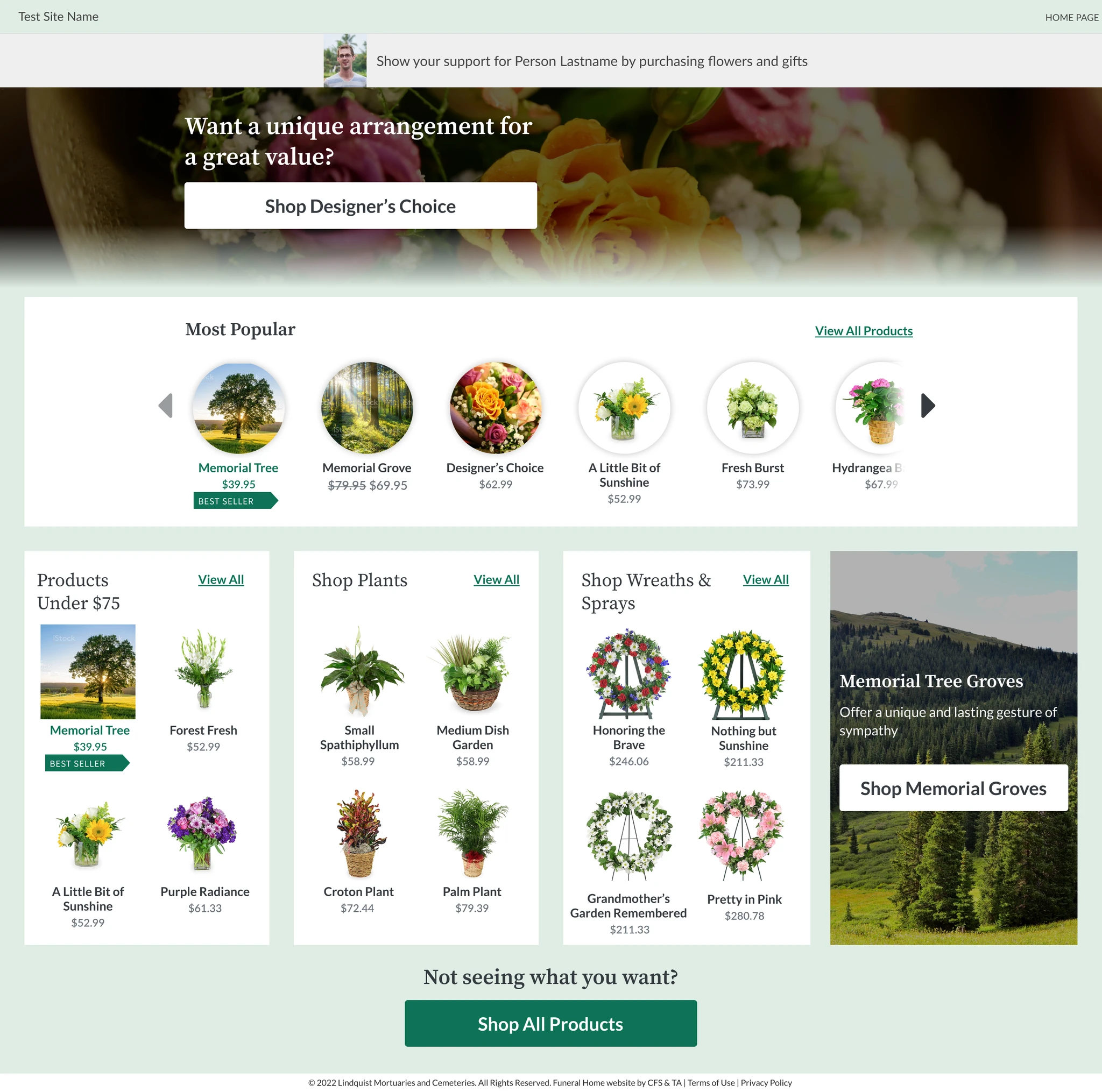
Taking inspiration from our market research, our team created a wide range of UIs to see what best highlighted our top products and resonated with stakeholders.

Two final selections were moved into development for AB testing.
The first was the option the design team advocated for that limited user decision making and clearly highlighted top products. The second was a stakeholder favorite inspired by Amazon that provided more product options to the user.
Final Solution
After AB testing, both options resulted in an increased conversion rate and validated our introduction of the categories page to provide additional guidance to users.
The design with fewer product options was more successful, resulting in a 10% increase to conversion rates.