Patient Dashboard Redesign
For an orthodontic management platform that allows for doctors, receptionists, and hygienists to easily manage their practices.

Context
The orthodontic management platform had recently acquired one of their competitors and needed to modernize their platform and integrate the new features into their own system.
Impact
Reworked the information architecture and pieces of the design system to easily introduce the new features from the acquisition and create a more scalable system.
Team
Operated as an individual consulting designer paired with a product manager for building out the new information architecture, and coordinated with the larger client design team for design system changes.
Plan
Map out existing user journeys across the product
Built and test new information architecture with current users
Deliver validated solutions for a new navigation and patient dashboard to developers
Goal
Expand product offerings and reduce churn for newly acquired users by improving platform usability and updating information architecture to allow for modularization.
User Journey Explorations
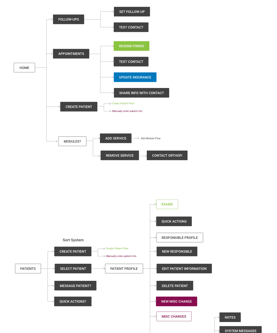
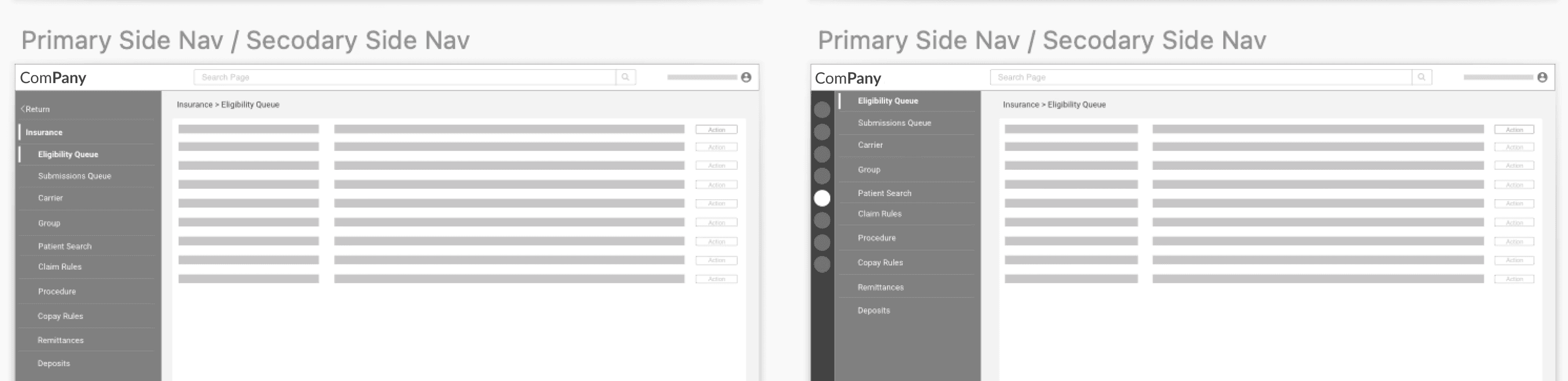
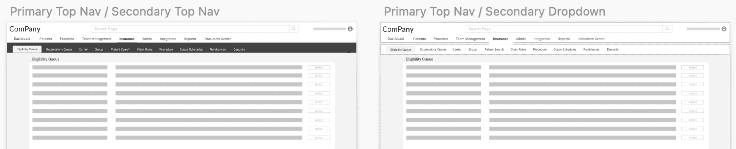
I began by mapping out the existing user journey to understand the most common interactions points and where any dependencies existed. From there, I built out several options for information architecture that would allow for easy accessibility and scalability.
User Validation
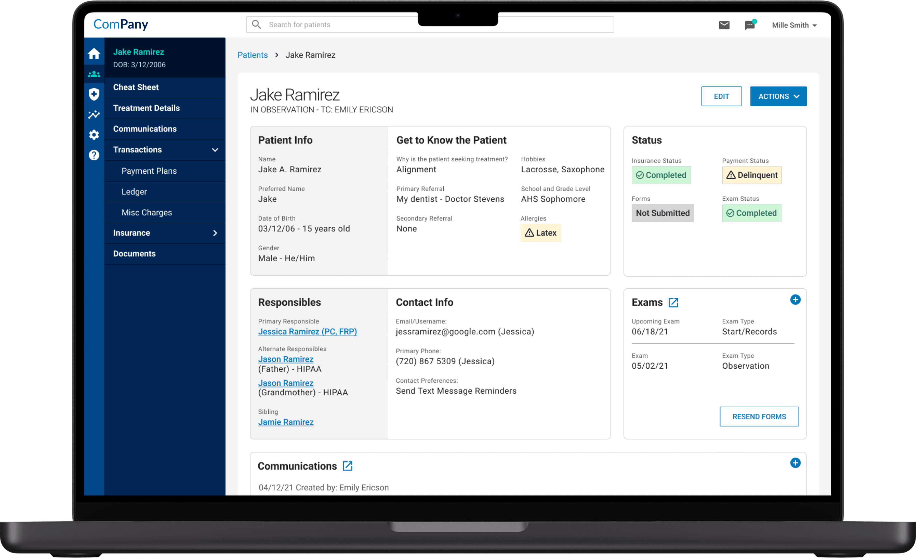
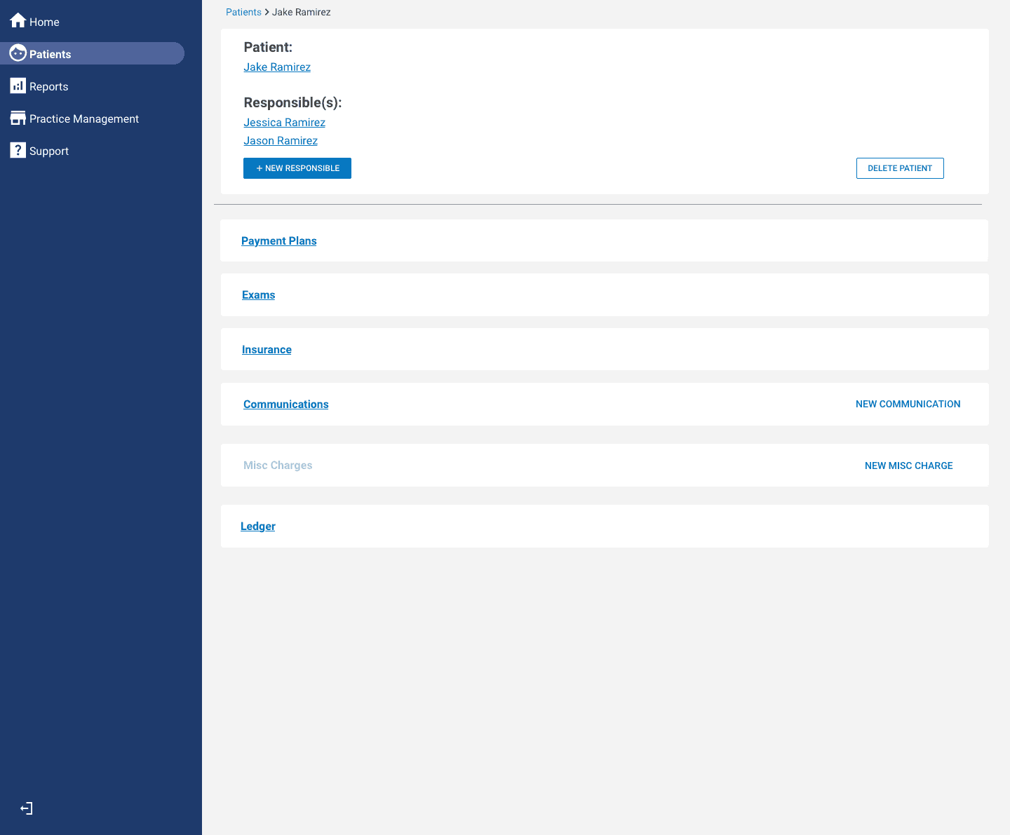
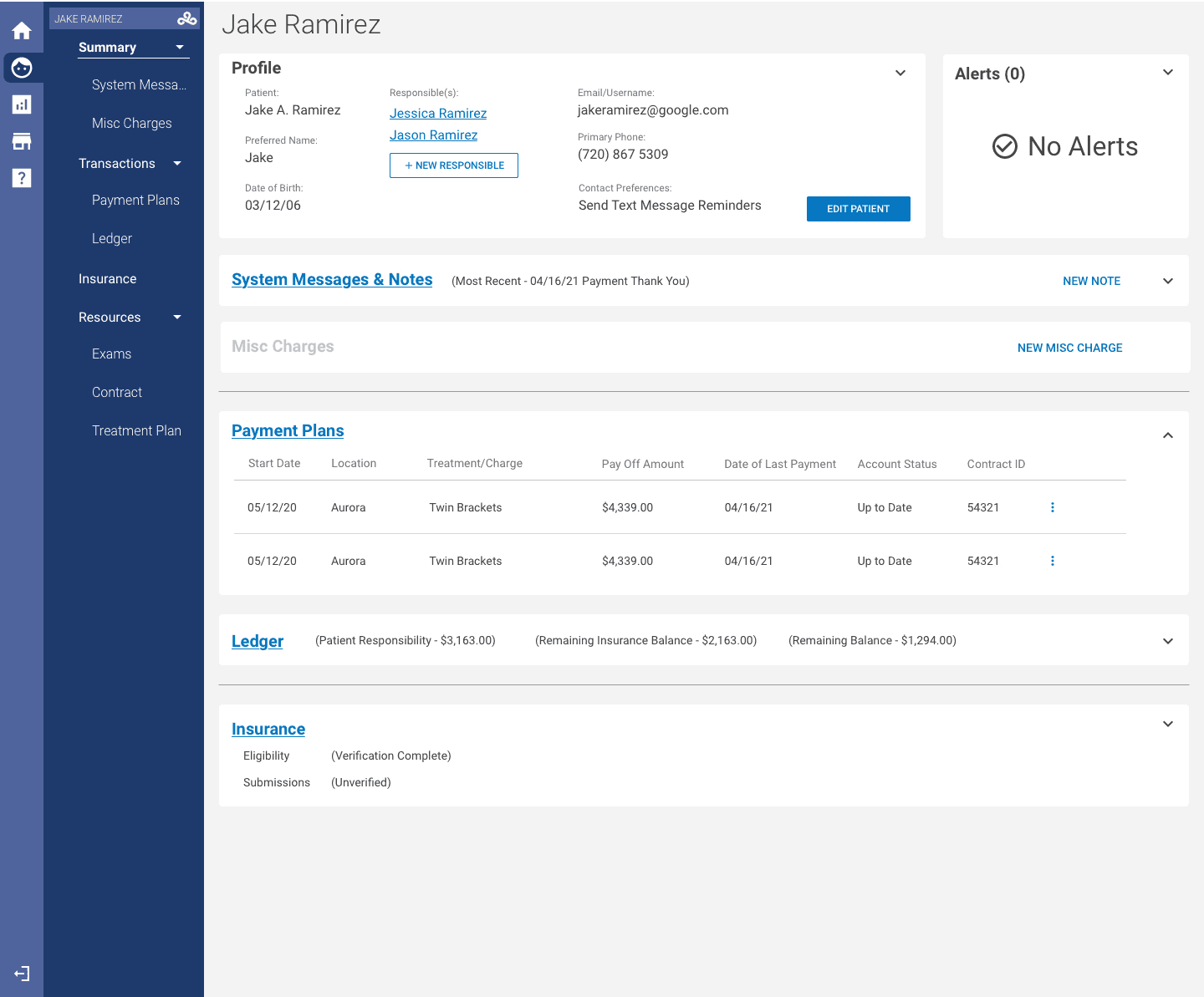
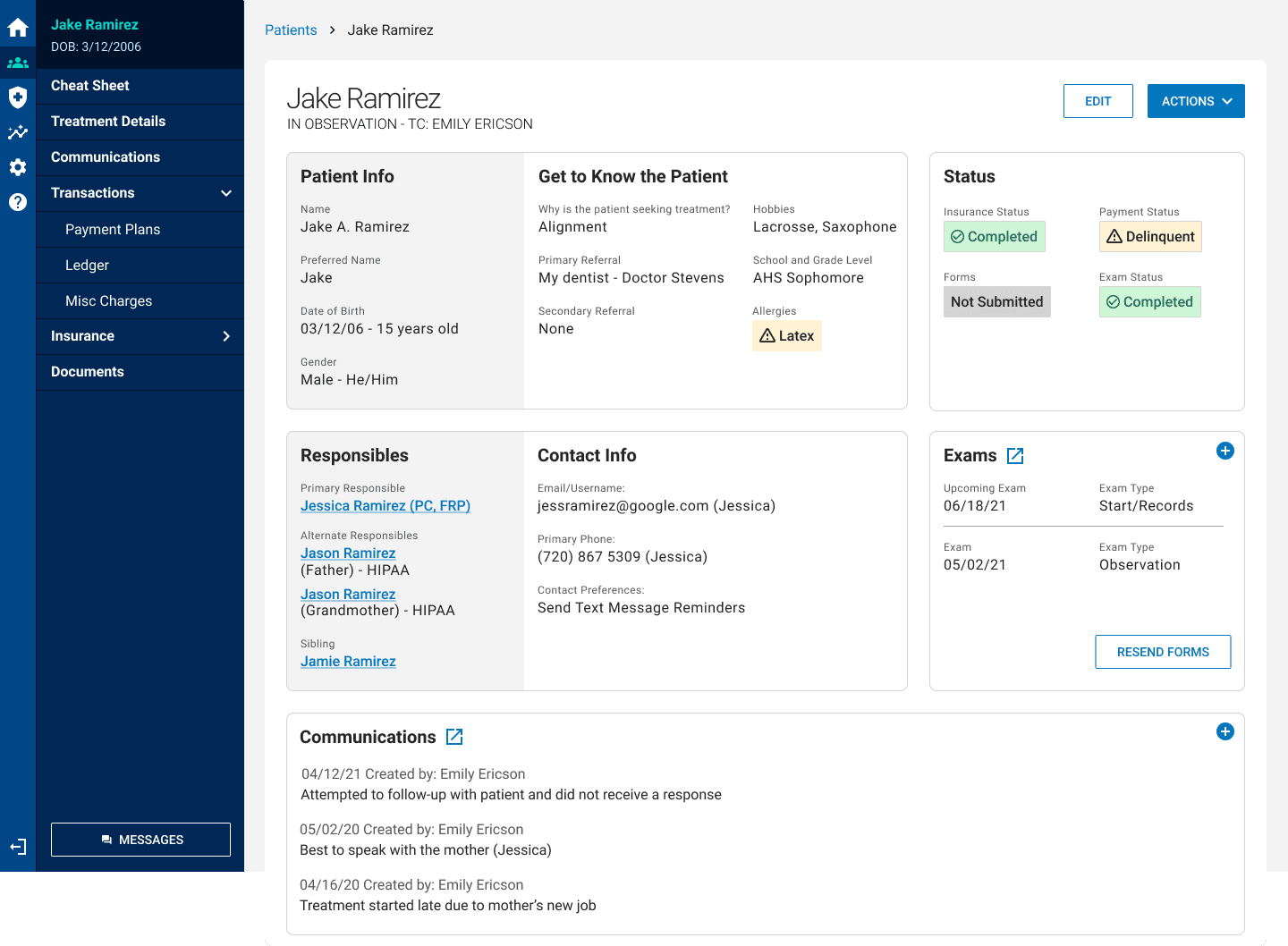
Once the team decided on which direction to take my proposed IA, we iterated on the page content formatting and brought it in front of users for feedback on the information hierarchy and level of intuitiveness. We proceeded with an open card structure rather than our initial accordion menu designs after finding that hiding content reduced functionality of the platform for users, and they preferred having prioritized data laid out in front of them right away.
Outcomes
Comprehensive navigation framework validated across multiple personas
New scalable dashboard format
Clean UI from new design system